Unpacking the Charm: Exploring How Plant-Based Packaging Evokes a Feeling of Innocence and Nostalgia
We can no longer ignore it. Vegan is here to stay. The popularity of Vegan and plant-based alternatives has been rising for years. And it’s noticeable everywhere, from supermarket shelves to dinner table conversations. More and more people are making the switch, driven by health, animal welfare, or environmental concerns.
The battle for the "share of wallet" is in full swing
But this rapidly growing demand for plant-based alternatives presents a challenge for providers in terms of standing out and winning customers from conventional meat, dairy, or fish products. To achieve this, providers must effectively communicate the value and appeal of their products to consumers.
I started noticing some patterns
As someone who wants to incorporate more plant-based options into their diet, I've noticed the development of a unique imagery surrounding veganism. This raises questions for me, such as why vegan products are often portrayed in a playful and whimsical manner. Can I still navigate via my personal codes of quality, taste, and allure?
A brief reflection on the semiotics (*) of this imagery: This reflection focuses on analyzing the codes, signs, and symbols used in packaging and other forms of communication to convey the values and benefits of vegan products.
Veganism is often associated with progressive and ethical values, and these values are reflected in the packaging codes for vegan food. By understanding these codes, companies can effectively communicate the value and appeal of their products to consumers.
As an example, we will look at La Vie, a brand recently introduced to the Dutch market that serves as a representative of the vegan/plant-based category.
La Vie unraveled
Let me try to explain my observation with a concrete example. La Vie is a brand recently introduced to the Dutch market and would perfectly represent this new vegan/plant-based category imagery.
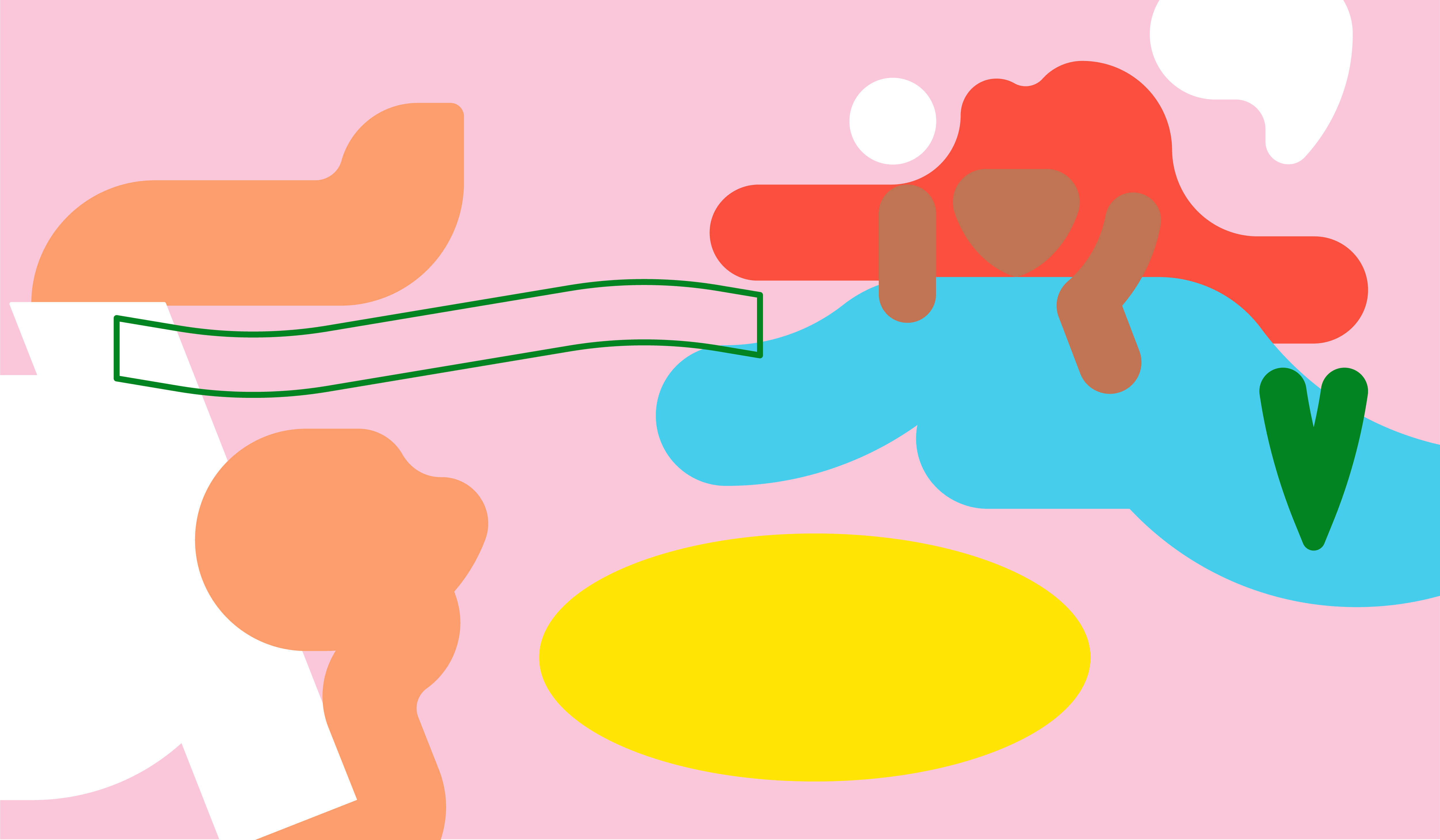
What catches my eye, looking at the packaging: Simple hand-drawn illustrations, use of retro colors, and playful typography seem to have become the norm for plant-based products.
First, the hand-drawn illustrations, look simple, childlike, playful, and slightly vintage to me. Why did the brand not opt for more realistic images or even pictures of ingredients? A farm or another natural setting? Something that links to nature or a promise of environmental friendliness. Something to help me make a judgment on the quality, taste, and authenticity of the product.

Illustrations have a certain nostalgia and romance. They are associated with a simpler, more natural way of living and thus respond to our desire for a return to a more natural, sustainable way of life.
Hand-drawn illustrations additionally evoke associations with artisanal quality (handmade, honest) and frame plant-based foods as a more natural and healthier alternative to pre-processed and animal products. A drawing can also be a way to convey sophistication and refinement. By using these design elements, the packaging can suggest that the product is of higher quality and has a more refined taste.
The playful, light-hearted, innocent, and childlike nature of the drawings is both accessible and inviting. It stimulates your imagination, reads like a print, and conveys the joy and pleasure of plant-based eating; a childishly simple, enjoyable, and satisfying choice.
Exploring the Vintage Mystique
“But why vintage?”, you might think. Do they want to suggest that plant-based food has a long history and cultural significance? Or are people attracted to vintage design elements because they remind them of a simpler, more carefree time in their lives?
Or maybe it’s appealing to people looking for healthier, more natural food options? Which could be a justification for the usually high price…
Either way, the vintage style seems intentionally used to counter the perception of veganism as a recent trend, and to position it as a timeless, respected dietary choice or to even embrace the trend of vintage itself.
Colors convey meaning
The use of color is also worth mentioning. Colors I would personally describe as trendy, muted, a bit retro, powerful, and full of energy. But what are typical colours for plant-based products and why exactly are green, pink, yellow, and red chosen so often?
The use of trendy colours can be seen to appeal to younger, more progressive audiences. They create a sense of fun and whimsy. These colours are also often muted, so rather subtle and not intrusive.
Green and brown are often used because these colours are associated with natural, organic, and eco-friendliness. Green in particular because of its association with nature, freshness, and health. Brown and earth tones evoke a sense of naturalness and authenticity. Both colours can trigger a sense of nostalgia and can be linked with tradition or artisanal techniques, which can appeal to consumers who value natural and organic products.
Red, yellow, or orange are used to attract attention and create a sense of energy and excitement. Blue is often associated with health and well-being. Purple and black with luxury and exclusivity.
Muted and retro colors are a popular choice in packaging for a reason. Not only do they convey a sense of sustainability and environmental friendliness, but they also evoke feelings of authenticity, calmness, and well-being. These colors are typically created using fewer synthetic dyes and chemicals, giving them a natural aesthetic that aligns with the product itself. In a crowded market, the use of muted and retro colors can help a brand stand out and create a unique and distinctive brand identity.
The incorporation of the colors used can be perceived as a strategy to attract younger, socially conscious consumers.
Typography
The choice of typography is also significant. Uncomplicated, simple handwriting and casual fonts are often used. This is because rounder letters convey friendliness, while fatter letters are easier to read and convey a more direct message.
A font like American Typewriter, as used by the iconic packaging of Dorset Cereals, emphasizes the attention and care paid to both the product and packaging.
Nowadays, simple, and legible typefaces are often used on the packaging, with sans serif fonts like Helvetica and Futura being popular choices. This is because they are easy to read and convey a modern and minimalistic feel.
On the other hand, the brand "La Vie" opts for a more handwritten typeface, which imparts a more natural and organic feel.
Conclusion
In conclusion, the imagery associated with veganism plays a crucial role in communicating the values and benefits of plant-based products to consumers. By understanding and effectively using these codes, companies can effectively communicate the appeal of their products and win customers from conventional alternatives.
La Vie is a well-designed packaging that effectively incorporates all relevant codes and subliminally appeals to me.
The following occurred in my mind in a brief moment:
- I'm looking for a healthy alternative to bacon cubes
- But it must look attractive and taste just as good as bacon
- Hey, that looks funny and inviting
- This looks like a natural product, made with care, and promises some quality
- Let me give that a try
Now, I will evaluate the taste to determine if I am a 'bacon buyer' and if the purchase of this product was worthwhile. 😉
(* Semiotics is the study of how meaning is conveyed through signs and symbols. Semiotics is applied within Haystack Consulting to really get to the bottom of a category and, as a result, also find new opportunities for NPD and positioning. Are you interested in this intriguing methodology? Haystack Consulting helps companies confirm and build their distinctiveness. Want to know more? Don't hesitate to contact me or one of our other semiotic experts. Ank van Ophoven, Strategic Advisor Qualitative.)